Starting eForm version 3.5 a new element was introduced, the repeatable element.

As the name suggests, it can be used to allow your users to add rows of predefined elements on your form. You can check out a demo here and download the from from this link.
Add a repeatable Element
Repeatable Element can be found under Other Form Elements (O) under the form builder. Open it and scroll down to the bottom. There you will see the newly created repeatable element.
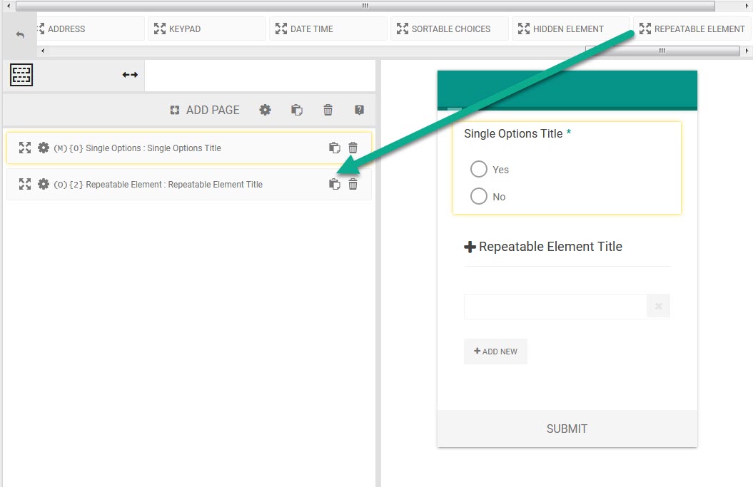
Drag the element on to your form and you are ready to go.
Interface Options
Under the settings window of the element, you will see INTERFACE.
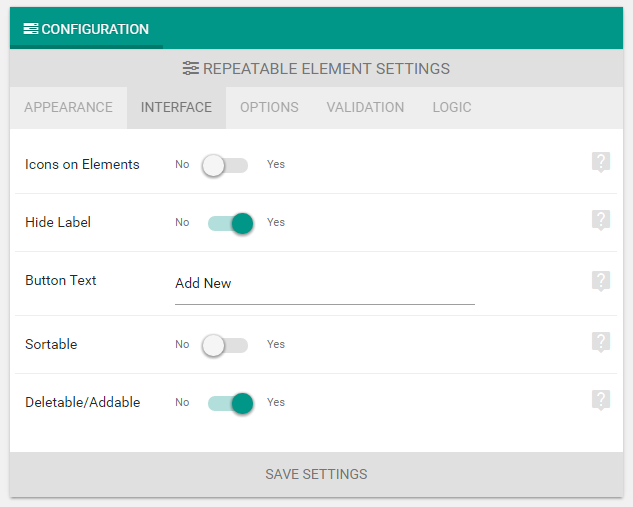
- Icons on Elements: Disable to hide icons from all repeatable element group items.
- Hide Label: Enable to hide labels from all group items.
- Button Text: Used to populate the add button.
- Sortable: If enabled, then user will be able to sort the repeated rows.
- Deletable/Addable: Enable this to actually make the element repeatable. If you want a fixed set of elements without the capability of deleting, then disable this.
Validation Option:
Under the same settings window, you will see VALIDATION. Here you can set
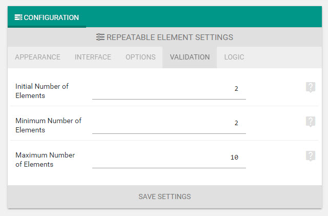
- Initial number of elements.
- Minimum number of elements.
- Maximum number of elements.
The delete button stops functioning when the element reaches minimum number and the add new button stops functioning when maximum is reached. You should make sure Initial number of elements is greater than or equals to minimum number of elements and lesser then or equals to maximum number of elements.
Adding Groups inside repeatable
Repeatable elements work by duplicating your predefined group. Every group can contain any number of the following elements:
- Radio Element.
- Checkbox Element.
- Dropdown (select) Element with Multi select.
- Textinput with a number of validation.
- Textarea.
- Password.
- Date, Time & DateTime Pickers.
Configuring groups
Open the settings of the repeatable element. You will see the settings window.
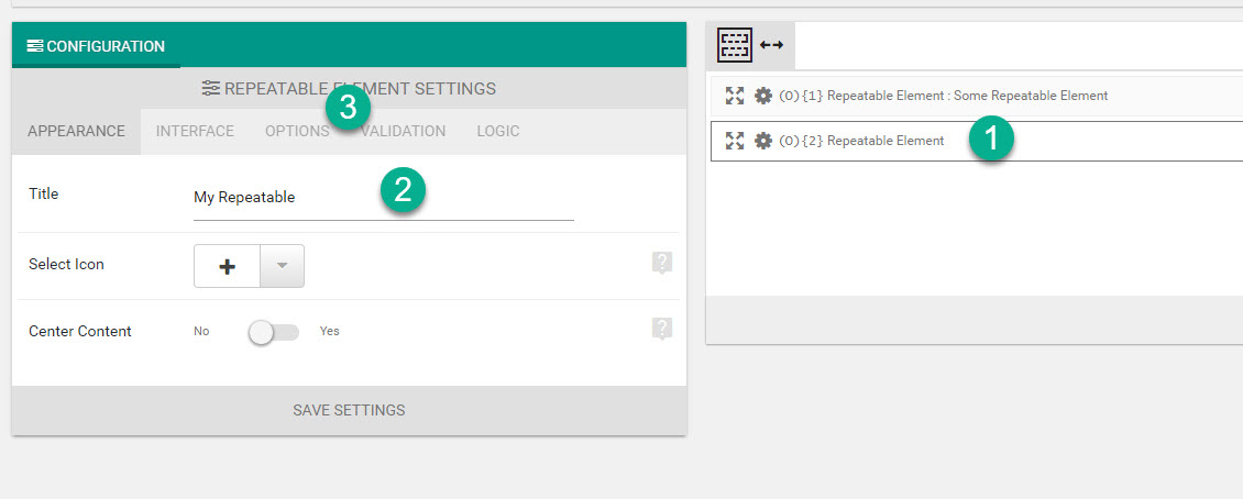
Now navigate to “OPTIONS” section of the window and you will see ITEM GROUP LIST.
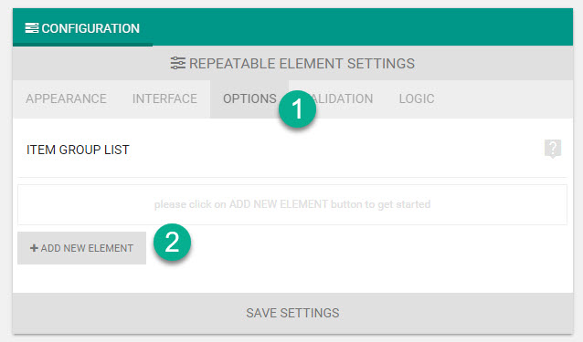
Click on ADD NEW ELEMENT and new item in your group will be created. Following configuration options are available.
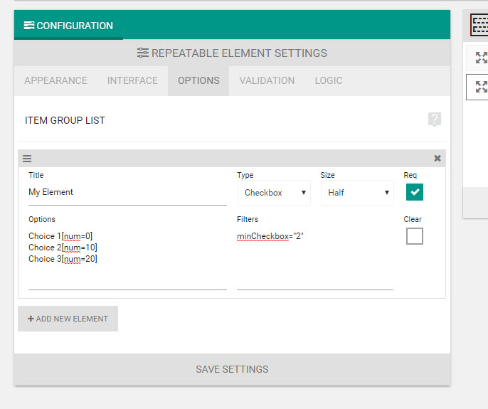
- Title: Form element title.
- Type: Form element type.
- Size: Column size of the element.
- Req: Whether the element is compulsory (required) or not. This is the primary validation rule.
- Options: Here you will enter choices for MCQs and placeholders for text inputs. We will discuss about it more.
- Filter: Other validation filters specific for some of the types. We will see more about this.
- Clear: Whether to clear columns before this element. Useful when building layouts and the height of the elements does not match. For example, if you wish to create a 4 column layout, then after every 4th element, i.e, on 5th element, 9th element etc, you would want to enable this.
Different Types of repeatable element

With eForm version 3.6.5 (at the time of writing) there are a total of 16 types of repeatable elements. Since many of them have very similar Options and Filters, we will discuss them together.
| Element Type | Options | Filters |
|---|---|---|
| Radio | You enter every option per line. You can also have mathematical value assigned to an option. Scoring isn’t possible. Option List with Numerics [html] Simple Options List [html] |
N/A |
| Checkbox | You can specify maximum and minimum number of checkboxes required.
[html] |
|
| Dropdown | You enter every option per line. You can also have mathematical value assigned to an option. Scoring isn’t possible. Option List with Numerics [html] Simple Options List [html] To enter an empty/placeholder option, add to the first of the list and have [html] |
N/A |
| Multiple Dropdown | ||
| Textinput | Here you will enter the placeholder text of the element. | You can have minimum and maximum string length through filters.
[html] |
| Password | ||
| Textarea | ||
| Phone Number | ||
| Anchor Link (URL) | ||
| Email Address | ||
| Person’s Name | ||
| Only Numbers | Here you will enter the placeholder text of the element. | You can limit the maximum and minimum numbers the element will take.
[html] |
| Only Integers | ||
| Date Picker | Here you will add the placeholder text of the element. | You can add future or past filters. Could be yy-mm-dd formatted date string or NOW for current date.
[html] This field does not really supports advanced filtering like the actual datepicker. |
| Time Picker | N/A | |
| Date Time Picker |
Now you know how to configure repeatable elements properly. Start using it and let us know if you have any troubles.