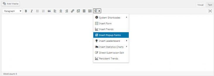
Adding popup forms through shortcodes in pretty easy.
Setting Popup Button
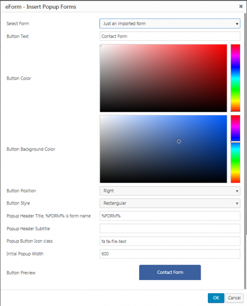
The essence of popup form is a popup button. With the options you can set it very easily.
- Button Text: Is what is shown in the button.
- Button Color: The color of the button text.
- Button Background Color: The background color of the button.
- Button Position: Where the button is placed on your screen.
- Button Style: By default buttons are rectangular. If you want to make circular buttons showing just the icon, enable it here.
- Popup header: Text shown in the popup header. Leave empty to disable.
- Popup Subtitle: Small text shown below popup header. Works only if header is not empty.
- Popup Button Icon Class: The class of the icon used in the button. The icons has to be supplied by your theme or some other plugin.
The options panel will also show a preview of the button right below the customization form. Once you are done, click on OK button and it will insert the shortcode.
Setting Custom Popup Trigger
It is possible to use any other anchor to trigger the popup form. It becomes handy if you want to use your theme’s button to trigger an eForm.
- Set the Button Position to Hidden / Manual Trigger.
- Now clicking the OK button will show you a message with trigger URL.
- You either note down the trigger URL and insert your theme’s button yourself.
- Or simply click OK on that message and it will insert a plain anchor tag on your content (along with the required shortcode) which you can customize.
- Make sure, the trigger button has the class
eform-manual-popupand properhrefset#ipt-fsqm-popup-form-{id}. The rest of the data attributes are optional.


